Armin Hofmann’s 1965 Graphic Design Manual presents a methodical, step-by-step instruction for problem-solving, deeply rooted in fundamental design elements and principles.
Historical Context of the Manual (1965)
Published in 1965 by Van Nostrand Reinhold, Armin Hofmann’s Graphic Design Manual emerged during a pivotal moment in graphic design history. It directly responded to a growing need for a systematic approach to design education, moving beyond purely aesthetic considerations.
The mid-1960s witnessed the height of Modernist principles, and Hofmann’s work embodied this ethos. George Nelson’s foreword underscored the manual’s novelty – a truly methodical instruction, starting with basic elements.
This publication coincided with a period of rapid change in visual communication, seeking clarity and functionality amidst increasing complexity. Hofmann’s manual offered a structured framework for navigating these challenges, influencing a generation of designers.
Armin Hofmann’s Design Philosophy
Armin Hofmann’s design philosophy, as articulated in his manual, centers on a rigorous exploration of fundamental visual elements – point, line, and form. He believed in a systematic approach, analyzing image and form to unlock expressive potential.
His work emphasizes clarity, contrast, and a purposeful use of space. Hofmann wasn’t solely focused on aesthetics; he prioritized a methodical problem-solving process.
The manual demonstrates his belief in confronting dissimilar elements, like form and lettering, to create dynamic compositions. He sought “new forms of expression,” pushing boundaries while remaining grounded in core principles.

Core Principles Outlined in the Manual

Hofmann’s manual meticulously details the importance of fundamental elements, including point, line, and form, alongside the impactful concept of ‘confrontation’ in design.
The Importance of Fundamental Elements
Armin Hofmann’s approach, as detailed in the Graphic Design Manual, emphasizes a return to the core building blocks of visual communication. He believed mastery of these fundamentals – point, line, and form – was crucial before tackling complex compositions.
This wasn’t simply about technical skill, but a philosophical stance; understanding how these elements interact unlocks a deeper understanding of design itself. Hofmann’s work consistently demonstrates this reliance, showcasing how impactful design can emerge from seemingly simple components. The manual serves as a rigorous exploration of these elements, providing exercises and analyses to solidify comprehension.
He advocated for a systematic study, moving from basic rudiments to more elaborate processes, ensuring a solid foundation for any graphic design challenge.
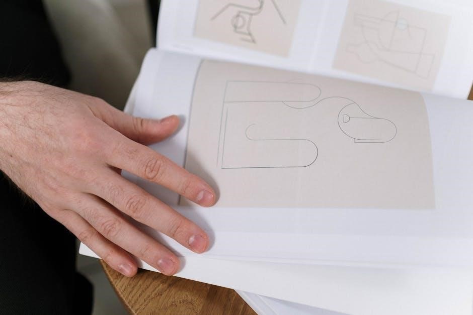
Point, Line, and Form as Building Blocks
Hofmann’s Graphic Design Manual meticulously dissects point, line, and form, presenting them not as isolated elements, but as interconnected components of visual language. The ‘dot’ is explored as a foundational unit, capable of generating rhythm and structure. Lines are analyzed for their weight, direction, and inherent meaning, influencing perception and guiding the eye.
Form, arising from the interplay of points and lines, becomes the vehicle for conveying ideas. Hofmann demonstrates how manipulating these basic elements—through contrast, composition, and scale—yields powerful visual results.
The manual’s exercises encourage students to deeply understand these building blocks before attempting complex designs.
The Concept of Confrontation in Design
Hofmann’s “Confrontation” principle, central to his Graphic Design Manual, advocates for the deliberate juxtaposition of dissimilar elements. This isn’t about harmonious blending, but about creating visual tension and dynamic relationships. He explores “encounters” between form and lettering, challenging conventional expectations.
By forcing contrasting elements to interact—perhaps through scale, color, or texture—Hofmann believed designers could unlock new expressive possibilities. This deliberate discord generates energy and compels the viewer to actively engage with the design.
The manual provides exercises to master this technique, fostering innovative visual communication.

Detailed Examination of Key Sections
Hofmann’s manual meticulously dissects design elements – the dot, line, and confrontation – alongside explorations of lettering and signs, offering practical application examples.
The Dot: Exploration and Application
Armin Hofmann initiates his systematic approach with the seemingly simple dot, emphasizing its foundational role in visual communication. He doesn’t treat it as merely a starting point, but as a potent element capable of diverse expression.
The manual explores the dot’s potential through variations in size, placement, and density, demonstrating how these alterations impact perception and create visual hierarchies. Hofmann illustrates how clusters of dots can generate texture, form, and even suggest movement.
Exercises encourage readers to analyze the dot’s relationship to negative space and its capacity to define edges and boundaries. This section lays the groundwork for understanding how fundamental elements build towards complex compositions, showcasing the dot’s surprising versatility.
The Line: Weight, Direction, and Meaning
Armin Hofmann meticulously dissects the line, moving beyond its basic definition as a connection between two points. He emphasizes that a line’s weight, direction, and texture profoundly influence its expressive power and communicative potential within a design.
The Graphic Design Manual demonstrates how varying line weights can establish visual hierarchy and create emphasis. Hofmann explores how different directions – horizontal, vertical, diagonal – evoke distinct psychological responses and convey specific meanings.
He encourages experimentation with line quality, from delicate and precise to bold and gestural, illustrating how these choices impact the overall tone and message of a composition. The line, for Hofmann, is a dynamic element, not merely a static divider.
Confrontation: Combining Dissimilar Elements
Armin Hofmann’s concept of “Confrontation” within the Graphic Design Manual is central to his design philosophy. It involves deliberately juxtaposing dissimilar elements – form and lettering, positive and negative space – to generate visual tension and dynamic interplay.
This isn’t about chaotic collision, but rather a controlled encounter designed to activate the viewer’s perception. Hofmann believed that such contrasts create a richer, more engaging visual experience than harmonious blending.
He illustrates how carefully considered confrontations can imbue a design with energy, meaning, and a sense of visual excitement, pushing beyond conventional aesthetic norms and fostering innovative expression.
Letters and Signs: New Forms of Expression
Armin Hofmann’s section on “Letters and Signs” in the Graphic Design Manual explores typography not merely as communication, but as a powerful visual element capable of independent artistic expression. He encourages designers to move beyond conventional letterforms and explore new possibilities.
Hofmann advocates for treating letters as abstract forms, manipulating their weight, spacing, and arrangement to create dynamic compositions. This approach extends to signs, viewing them as opportunities for innovative visual language.
He demonstrates how these explorations can yield fresh, impactful designs, transcending traditional typographic constraints and forging new avenues for visual storytelling.

Methodical Approach to Graphic Design
Hofmann’s manual champions a systematic design process, guiding readers step-by-step from basic principles to complex problem-solving through image and form analysis.
Step-by-Step Instruction and Problem Solving
Armin Hofmann’s Graphic Design Manual distinguishes itself through its deliberate, instructional approach. It isn’t merely a showcase of finished work, but a fundamentally new attempt to dissect and teach the process of graphic design. The manual functions as a course, progressively building skills from rudimentary elements to intricate compositions.
This methodical structure emphasizes a problem-solving mindset. Hofmann doesn’t offer pre-defined solutions; instead, he equips the reader with tools for analyzing challenges and developing their own responses. The book’s strength lies in its ability to transform abstract concepts into practical, actionable steps, fostering independent thought and creative exploration within a structured framework.
Analyzing Image and Form
Hofmann’s manual places significant emphasis on the critical dissection of visual components. He advocates for a rigorous examination of image and form, urging designers to move beyond superficial aesthetics and delve into the underlying principles governing their impact. This analytical approach isn’t limited to pre-existing imagery; it extends to the creation of forms from basic elements.
The text encourages students to understand how elements interact – how a point defines a line, and how lines construct form. Through detailed exercises, Hofmann guides readers to deconstruct visual information, identifying its strengths, weaknesses, and potential for manipulation to achieve desired communicative effects.
Developing a Systematic Design Process
Armin Hofmann’s manual isn’t merely a collection of techniques; it’s a blueprint for cultivating a systematic design process. He champions a methodical approach, starting with fundamental rudiments and progressing to complex applications. This isn’t about rigid rules, but about establishing a framework for informed decision-making.
The manual presents a course of instruction, guiding the reader step-by-step through problem-solving. It emphasizes analyzing challenges, experimenting with solutions, and iteratively refining designs. Hofmann’s approach prioritizes understanding why a design works, not just how it looks, fostering a deeper, more thoughtful practice.

Visual Examples and Exercises
Hofmann’s manual features numerous composition studies, analyses of forms from nature, and practical exercises to apply core principles, fostering skill development.
Composition Studies and Analysis
Armin Hofmann’s Graphic Design Manual heavily emphasizes composition studies as a crucial learning tool. The manual doesn’t simply present finished designs; it dissects the process of arriving at them. Students are encouraged to meticulously analyze existing compositions, identifying how fundamental elements – point, line, and form – interact to create visual hierarchy and meaning;
These studies aren’t limited to pre-existing artwork. Hofmann prompts exploration through exercises involving the arrangement of basic shapes, demonstrating how even simple forms can generate dynamic and engaging compositions. The goal is to develop a discerning eye, capable of recognizing effective compositional strategies and applying them to solve design challenges. This analytical approach forms the bedrock of Hofmann’s methodical design process.
Studies from Nature and Everyday Objects
Armin Hofmann’s Graphic Design Manual advocates for grounding design principles in observation of the natural world and commonplace items. He believed that understanding the inherent structures and forms found in nature – like the veins of a leaf, exemplified by his Autumn Leaf Studies – could profoundly inform graphic design.
The manual encourages students to move beyond abstract exercises and directly engage with their surroundings. Analyzing the shapes, textures, and spatial relationships of everyday objects cultivates visual sensitivity and provides a rich source of inspiration. This approach fosters a deeper understanding of form and its potential for expressive communication, moving beyond purely theoretical concepts.
Application of Principles to Practical Exercises
Armin Hofmann’s Graphic Design Manual doesn’t remain solely in the realm of theory; it strongly emphasizes translating learned principles into tangible design solutions. The manual features numerous exercises designed to challenge students to apply concepts like point, line, and form to real-world scenarios.
These practical applications move beyond simple compositions, pushing designers to confront challenges involving typography, image integration, and spatial organization. Hofmann’s methodical approach encourages a systematic process of analysis, experimentation, and refinement, ultimately building confidence and skill in tackling complex graphic design problems effectively.

Influence and Legacy of the Manual
Hofmann’s manual profoundly impacted graphic design education, establishing a new methodical approach and influencing modernist design through its core principles.
Impact on Graphic Design Education
Armin Hofmann’s Graphic Design Manual revolutionized pedagogical approaches within graphic design education. Prior to its publication in 1965, instruction often lacked a systematic, foundational framework. Hofmann’s work provided precisely that – a structured, step-by-step course, beginning with the most basic elements and progressing to complex problem-solving.
The manual’s emphasis on fundamental principles – point, line, form, and confrontation – became cornerstones of curricula worldwide. It moved beyond stylistic trends, focusing instead on the underlying logic and methodology of design; Students were encouraged to analyze, deconstruct, and rebuild visual forms, fostering a deeper understanding of design’s core tenets. This approach continues to influence design programs today, emphasizing critical thinking and a rigorous exploration of visual language.
Hofmann’s Influence on Modernist Design
Armin Hofmann significantly shaped Modernist design through his rigorous approach and emphasis on fundamental elements. His Graphic Design Manual, published in 1965, wasn’t merely a how-to guide, but a philosophical statement advocating for clarity, precision, and a systematic methodology.
Hofmann’s work, including projects for Geigy and the Children’s Traffic School, exemplified a restrained aesthetic, prioritizing function and legibility. He skillfully employed contrast and confrontation, creating dynamic compositions. His influence extended beyond Switzerland, impacting designers globally who sought a more intellectual and disciplined approach to visual communication, solidifying his place within the Modernist canon.
Continued Relevance in Contemporary Practice
Armin Hofmann’s Graphic Design Manual remains remarkably relevant today, despite being published in 1965. Its core principles – focusing on point, line, form, and systematic problem-solving – transcend stylistic trends. Contemporary designers still grapple with the same fundamental challenges of visual communication that Hofmann addressed;
The manual’s emphasis on a methodical approach resonates in an era of rapid digital production, encouraging thoughtful consideration of design choices. Hofmann’s exploration of confrontation and expression through lettering continues to inspire innovative typography and layout. His work serves as a potent reminder of the enduring power of foundational design principles.

Technical Aspects and Production
Originally published by Van Nostrand Reinhold in 1965, the Manual’s design was meticulously crafted by Hofmann himself, utilizing chalk lithograph and drawn-on-film techniques.
Original Publication Details (Van Nostrand Reinhold)
Armin Hofmann’s Graphic Design Manual: Principles and Practice was first published in 1965 by Van Nostrand Reinhold, a prominent American publisher of technical and scientific books. This initial release established the manual as a cornerstone text within graphic design education.
The publication marked a significant moment, offering a structured approach to design thinking rarely seen at the time. Van Nostrand Reinhold’s backing provided the book with broad distribution, reaching students and professionals across the United States and beyond.
George Nelson penned the foreword, further validating the manual’s importance and influence within the design community. The book’s enduring legacy stems, in part, from this strong initial publication and support.
Design of the Manual Itself (by Hofmann)
Armin Hofmann meticulously designed the Graphic Design Manual, embodying his design philosophy within its very structure. The manual isn’t merely a text about design; it is a demonstration of effective visual communication.
Hofmann’s layout prioritizes clarity and visual hierarchy, utilizing a restrained aesthetic that emphasizes the core principles he teaches. The book’s exceptional design serves as a practical example of his methodical approach.
He skillfully employs typography, whitespace, and image placement to guide the reader through complex concepts, showcasing his mastery of fundamental elements and their interplay.
Chalk Lithograph and Drawn on Film Techniques
Armin Hofmann frequently employed chalk lithography and drawn-on-film techniques in his broader artistic practice, influencing the visual language of the Graphic Design Manual. These methods allowed for a unique textural quality and expressive freedom, departing from the precision of mechanical reproduction.
The manual subtly reflects this approach through its emphasis on hand-rendered forms and explorations of materiality. Hofmann’s experimentation with these techniques demonstrates a commitment to direct engagement with the design process.
This tactile sensibility is evident in the manual’s visual examples, showcasing the potential of combining traditional and modern approaches to graphic design.

Further Exploration of Hofmann’s Work
Hofmann’s prolific career extended beyond the manual, encompassing projects like the Geigy and Children’s Traffic School designs, and captivating autumn leaf studies.
Beyond the Manual: Other Notable Projects
Armin Hofmann’s influence resonates far beyond the pages of his celebrated Graphic Design Manual. He achieved significant recognition for diverse projects, notably his impactful work with Geigy, a Swiss chemical company, where he crafted compelling visual communications.
Furthermore, his designs for the Children’s Traffic School in Basle demonstrated a playful yet purposeful application of his design principles, prioritizing clarity and safety for young learners.
Hofmann’s artistic explorations, such as his detailed autumn leaf studies, reveal a deep connection to nature and a commitment to observing and translating organic forms into compelling graphic compositions, enriching his overall design approach.
Geigy and Children’s Traffic School Designs
Armin Hofmann’s collaborations with Geigy exemplify his ability to translate complex information into visually engaging communications. His designs for the company showcased a masterful use of color combinations and form, reflecting his core design philosophy outlined in the Graphic Design Manual.
Equally notable are his designs for the Children’s Traffic School in Basle, where he prioritized clarity and safety through intuitive visual cues. These projects demonstrate a practical application of his principles, proving their effectiveness beyond theoretical instruction.
Both endeavors highlight Hofmann’s versatility and commitment to impactful design solutions.
Autumn Leaf Studies and Artistic Influences
Armin Hofmann’s “Autumn Leaf Studies” reveal a deep connection to nature and artistic exploration beyond commercial work. These studies, often created using crayon and chalk lithograph techniques, demonstrate his fascination with organic forms and color variations – elements he later integrated into his design principles.
Influenced by artists like Kandinsky and Klee, Hofmann sought to distill natural beauty into its essential components, mirroring his focus on point, line, and form within the Graphic Design Manual.
These artistic pursuits enriched his design vocabulary and informed his methodical approach.